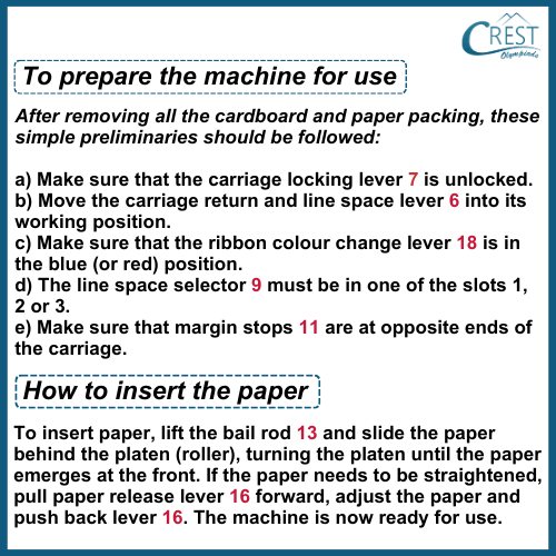
I. Read and observe the given instruction manual for a simple typewriter and answer the questions from 1-5 based on it:
1. Which one of these is incorrectly matched?
a) 16-pull paper release
b) 13-bail rod
c) ribbon colour change lever-7
d) line space selector- 9
Answer: d)
2. The manual is about:
a) unpacking a simple typewriter
b) using a typewriter
c) how to set up a typewriter after unpacking
d) how to reset a typewriter if it gets stuck
Answer: c)
3. Identify the wrong statement as per the manual:
a) The carriage locking lever should be unlocked.
b) The line space selector must be in one of the slots- 4, 5 and 6
c) Ribbon colour change lever should either be in blue or red colour.
d) The margin stops should be at the opposite ends of the carriage.
Answer: b)
4. Fill in the blank:
If the paper needs to be straightened, the pull ____________.
a) bail rod
b) carriage locking lever
c) paper roller
d) paper release lever
Answer: d)
5. Identify the wrong statement as per the manual:
a) The preliminaries include five crucial steps.
b) The typewriter comes packed in a polythene sheeting.
c) Paper has to be slided behind the platten for insertion and platten needs to be rolled.
d) The machine doesn’t need any preparation before use.
Answer: b)
II. Read the given article and answer the questions from 5-10 based on it:
You’re sitting in your eye doctor’s office and they pull out a chart of what appears to be a random selection of letters. You breeze through the first few lines, but by the bottom, you’re starting to second-guess yourself. Is that an F or a P? Or maybe an R?
At this point, you may be wondering: Where did these letters even come from? And who chose them?
With curiosity as our guide, we decided to dig deep into the history of optotype and how the Snellen Chart went from medical innovation to standard practice and all the way to pop culture ubiquity.
While glasses and other corrective lenses have been around for thousands of years, it wasn’t until more recent history that doctors had a standardised system for determining prescriptions.
The idea for the modern eye chart began with German ophthalmologist Heinrich Küchler. In 1835, Küchler cut images of various objects and animals from calendars and almanacks and pasted them onto a sheet of paper in decreasing sizes. Because it was difficult to control the consistency of the style and weight of these images, Küchler also published a version of the chart using blackletter text set in single lines in decreasing size in 1843.
Küchler’s chart was not widely adopted and, in 1862, Dutch ophthalmologist Herman Snellen developed his own version of the chart that is still the foundation of what is used today. Snellen’s first chart consisted of dingbats (squares, circles, plus signs, etc.) but, like Küchler, he eventually decided that letters would be easier for patients to identify and describe consistently. Unlike Küchler, however, Snellen believed that monoline letterforms of consistent size would be easier to read and he developed his own typeface, now referred to as optotype.
While traditional letterforms use varying widths and heights to give the appearance of consistency, Snellen built his optotype on a rigid 5×5 grid so that each letter is truly mathematically consistent and takes up the exact same amount of space.
In 1959, Dr. Louise Sloan of Johns Hopkins University created a new optotype with a cleaner sans-serif design. Like Snellen’s, Sloan’s letters are formed within a perfect square. Both the Snellen and Sloan optotypes contain letters that were chosen for their easily identifiable verticals, horizontals, and diagonals—C, D, E F, L, O, P, T, and Z for Snellen and C, D, H, K, N, O, R, S, V, and Z for Sloan. Sloan’s letters are considered better for equal legibility and are particularly effective at identifying astigmatism. Sloan’s letters and variations on them are still commonly used in eye charts today.
6. Arrange the following inventors of optotypes in the descending order:
I. Dr. Louise Sloan
II. Herman Snellen
III. Heinrich Küchler
a) I, II, III
b) II, I, III
c) III, I, II
d) III, II, I
Answer: a)
7. What are optotypes?
a) camera lens tests
b) vision testing charts
c) retina correction figures
d) latest eye lens cleaning technology
Answer: b)
8. Why are Sloan’s letters considered better?
a) They are more readable
b) They have ornamented font types
c) They can detect astigmatism
d) Both a and c
Answer: d)
9. What is meant by ‘ubiquity’?
a) The fact that something seems to be everywhere or in several places at the same time; the fact that something is very common
b) The idea of clarity in vision
c) The promise that cannot be broken at any cost
d) Consistency and patience
Answer: a)
10. Identify the wrong statement as per the article:
a) Küchler published a version of the chart using blackletter text set in single lines in decreasing size in 1843.
b) In 1959, Dr. Louise Sloan of Johns Hopkins University created a new optotype with a cleaner sans-serif design.
c) In 1862, Dutch ophthalmologist Herman Snellen developed his own version of the chart that is still the foundation of what is used today.
d) what we use today as optotypes is a blend of what all the three above-mentioned people developed.
Answer: d)


